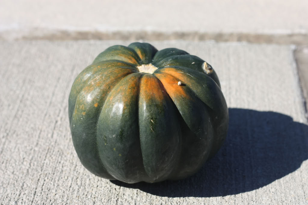
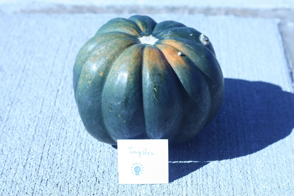
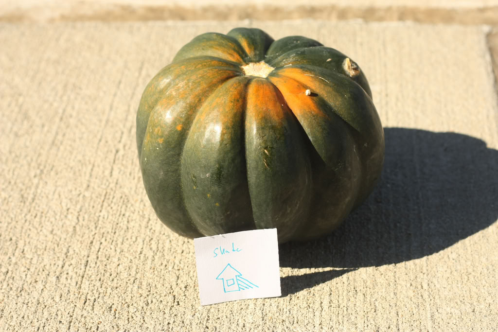
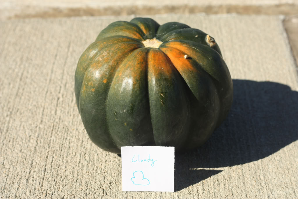
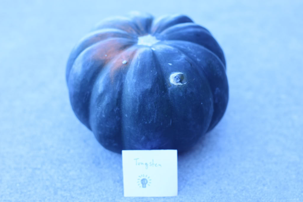
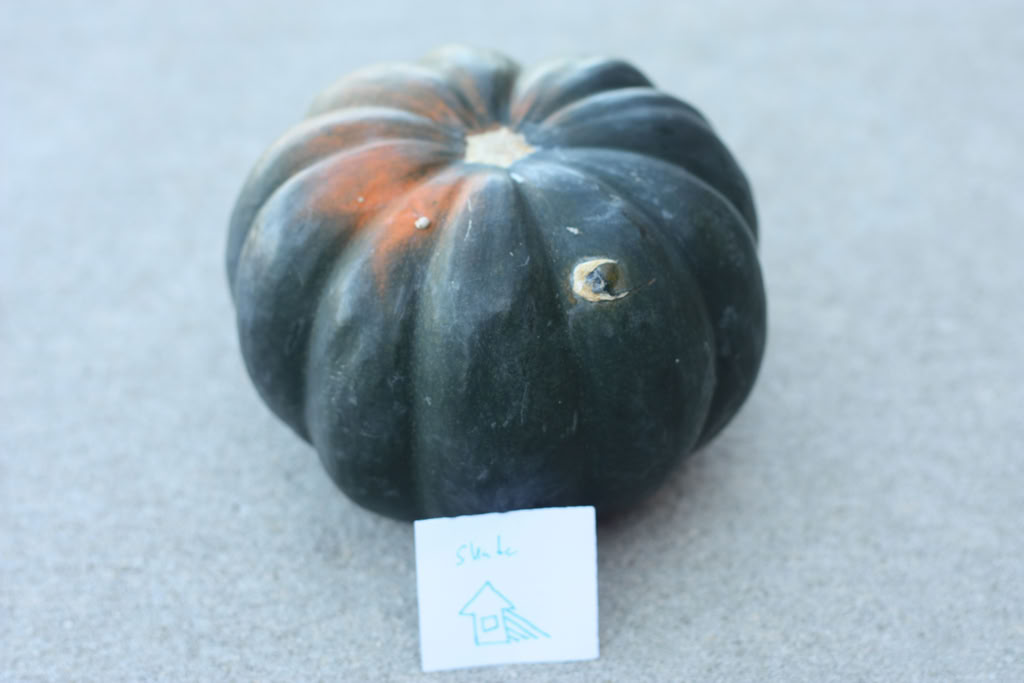
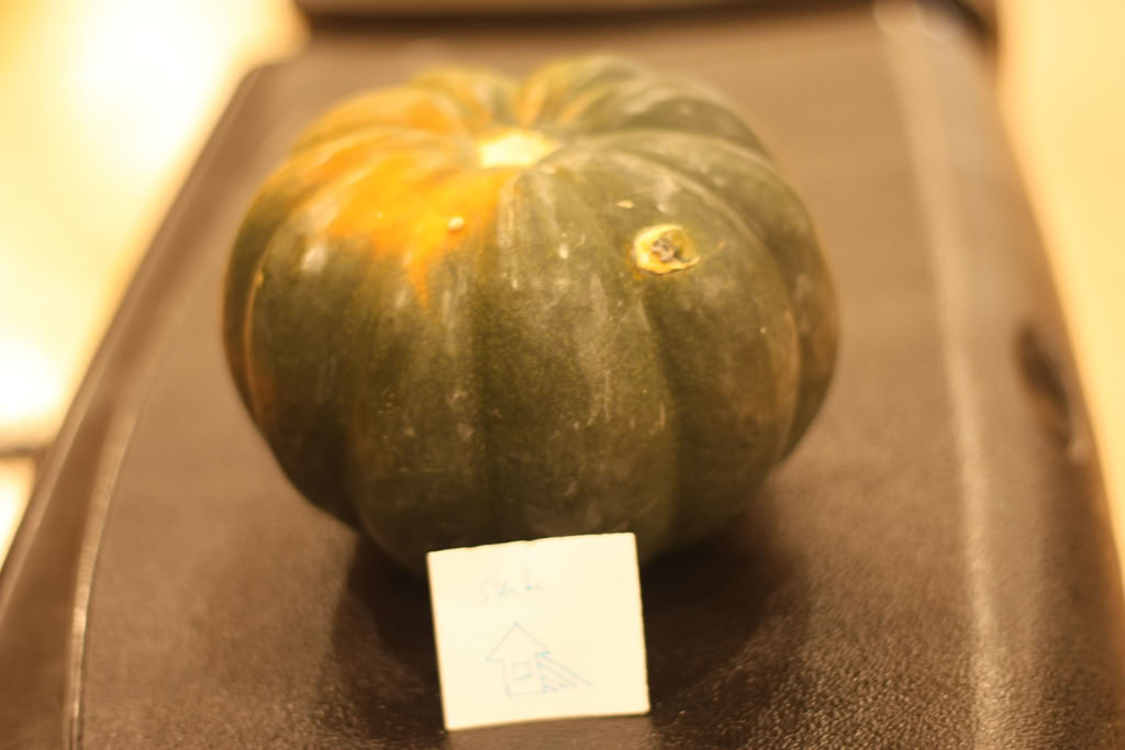
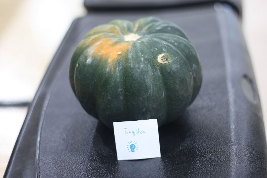
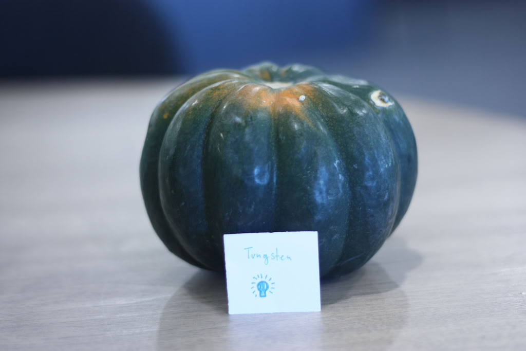
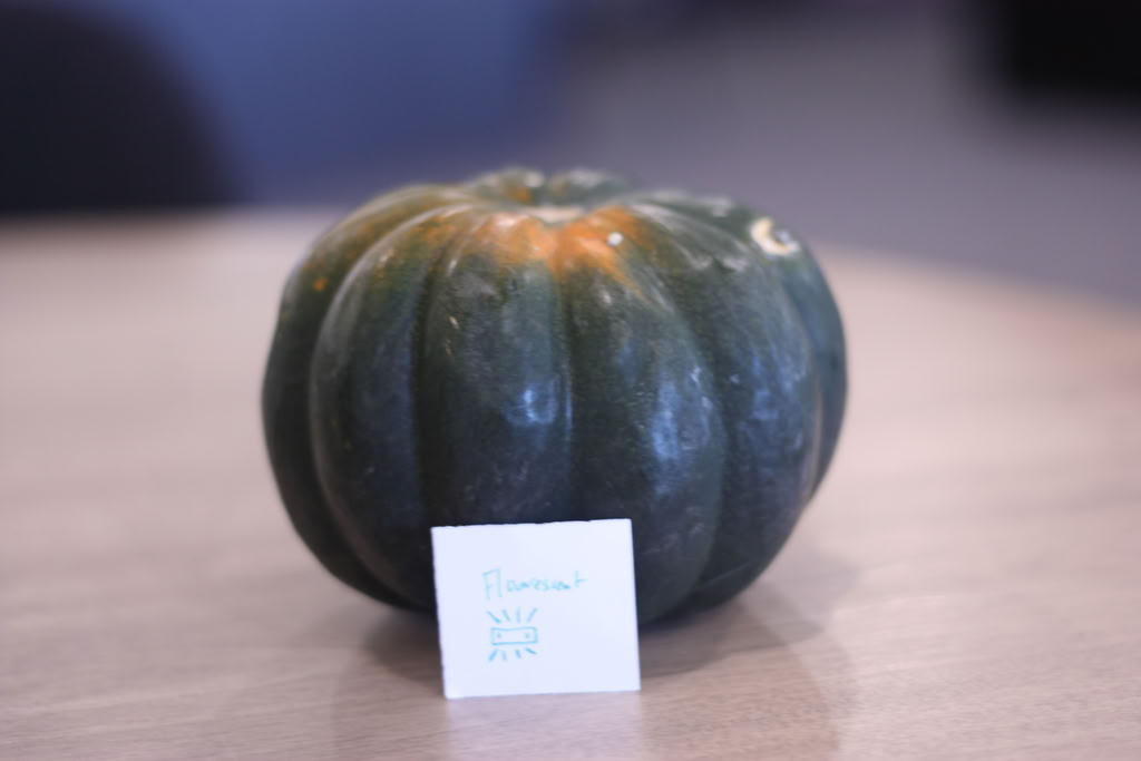
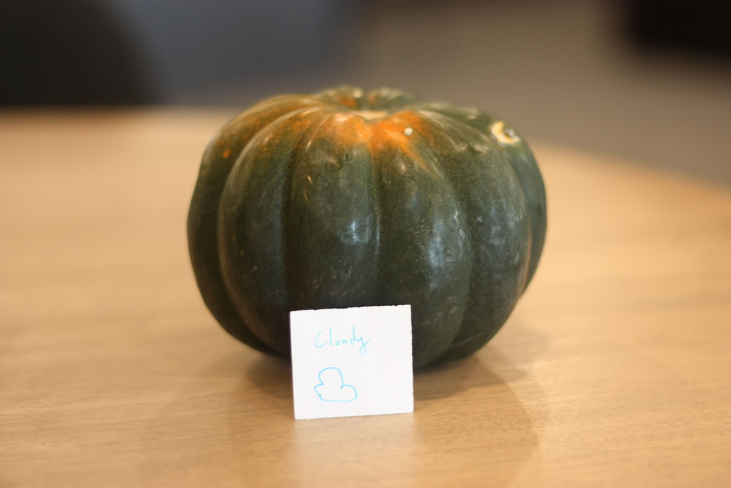
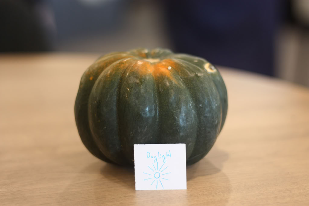
ISO is part of the exposure triangle. If a picture has is overexposed there might be too much ISO. The ISO for a camera is what makes a picture grainy or not. If a picture has a low ISO, then it will be a lot smoother, but if the ISO is high, then there will be some graininess. Depending on what the photographer wants both of these can be useful. White balance is a setting on many cameras that controls how much whiteness will show through in a picture. Usually these settings are called shade, tungsten, cloudy etc. Depending on the setting, the photographer might want to use different settings to make sure the white balance is perfect for the picture. This can change the mood of the picture. A blue picture can look more moody and colder, while a more yellow picture looks warmer and sometimes oversaturated. If a picture looks warmer or cooler, that is because of color temperature. Warmer colors such as red, orange and yellow tend to make a picture then feel warmer. Cooler colors like green, blue and purple will make a picture feel cooler because they are cool colors. Bracketing is when a photographer is trying to find the perfect exposure for a picture. This will set the camera to take three pictures: one with the exposure where the camera thinks it should be, one with exposure at a notch too high and one with a notch two low. Usually it’s set to -1, 0, and +1. The photographer then decides which picture they like the best and sets their camera to that setting.
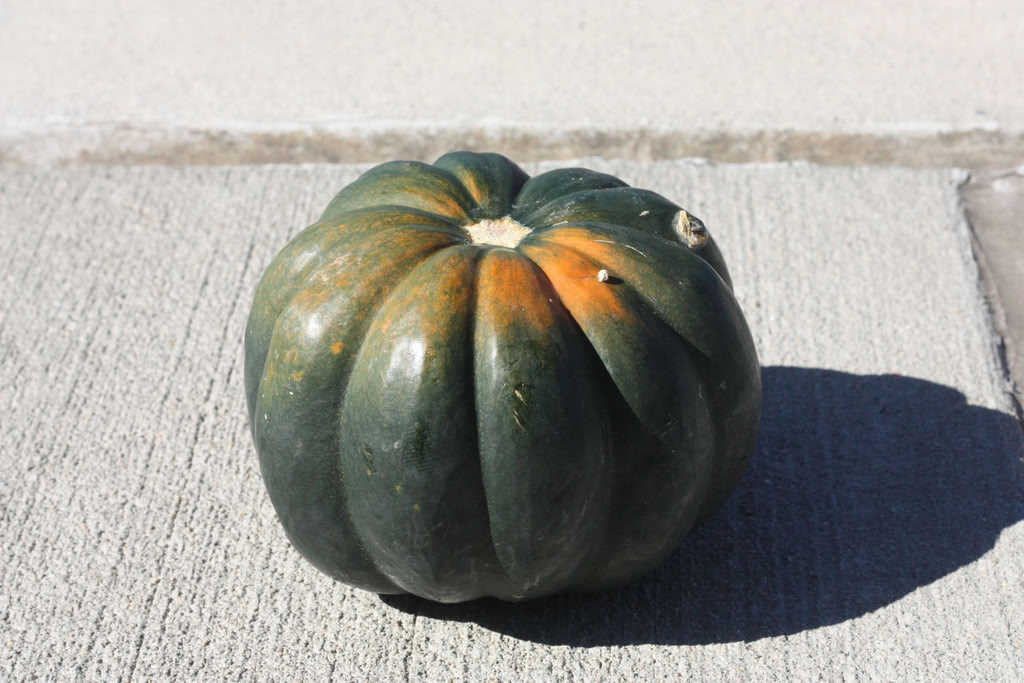
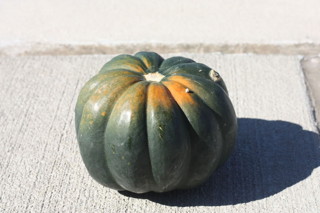
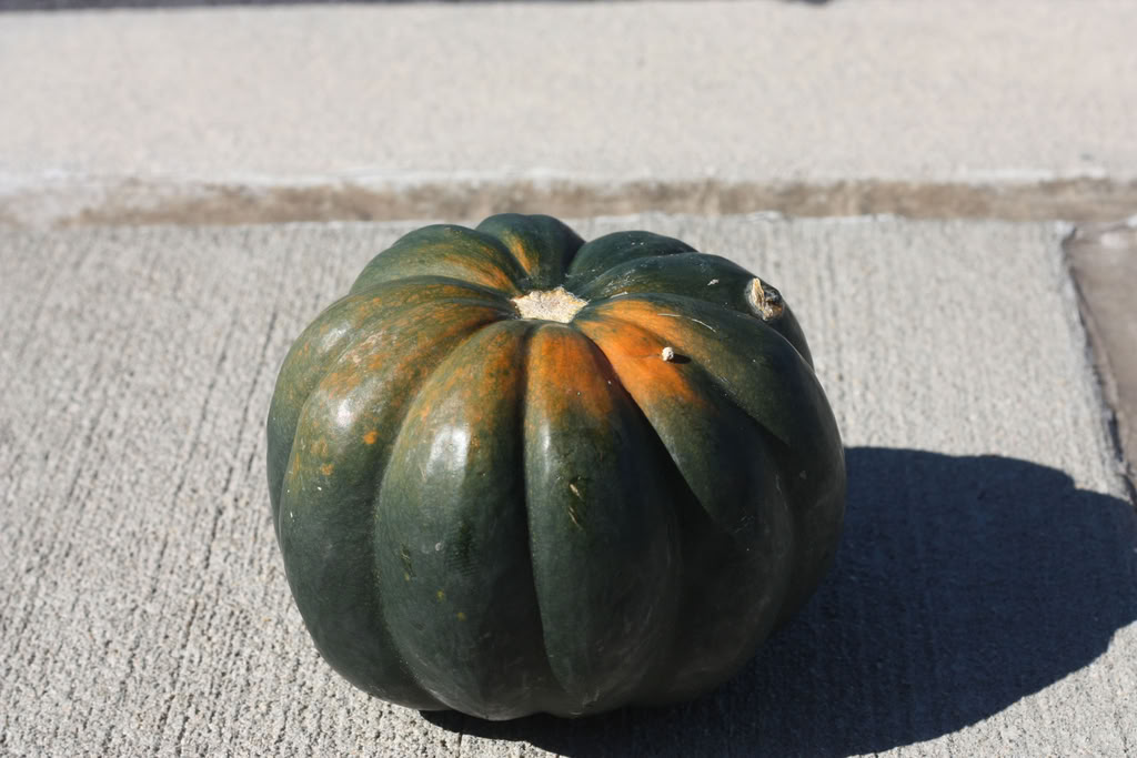
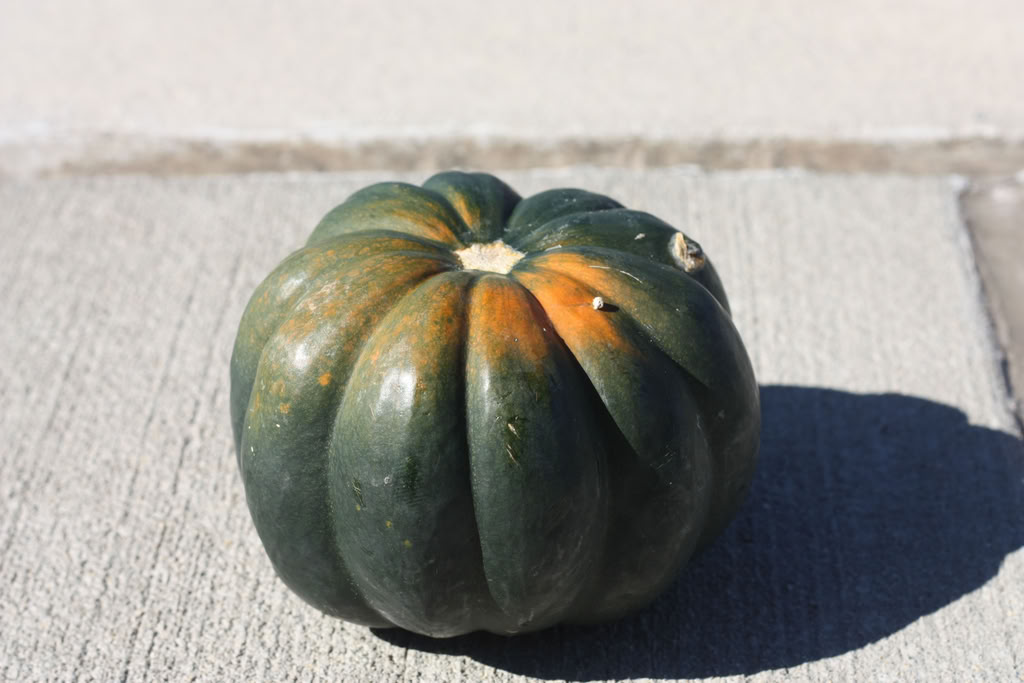
These pictures were all taken at various ISO levels. In the 1600 one the background is super crisp but it’s also bordering on grainy. In the lowest one the background is smoother, but then it doesn’t have as much depth.
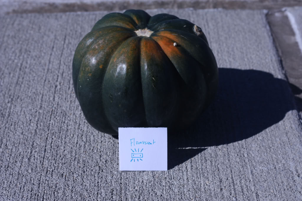
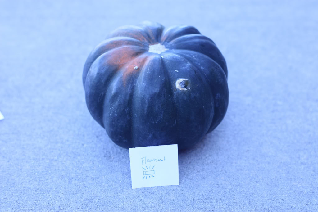
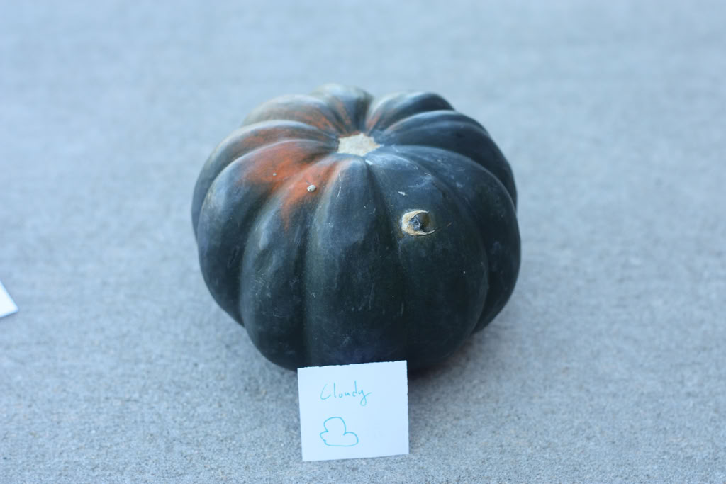
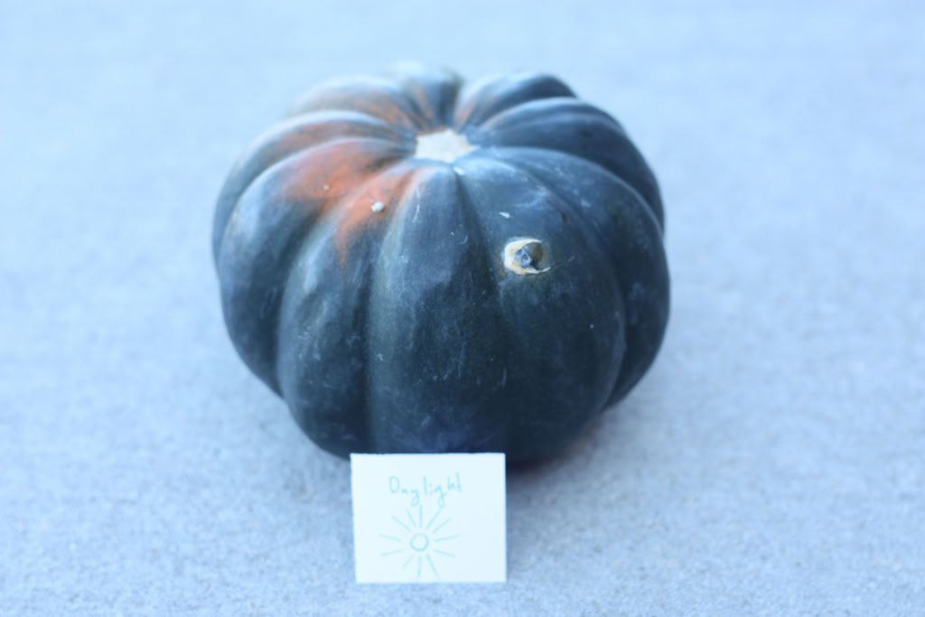
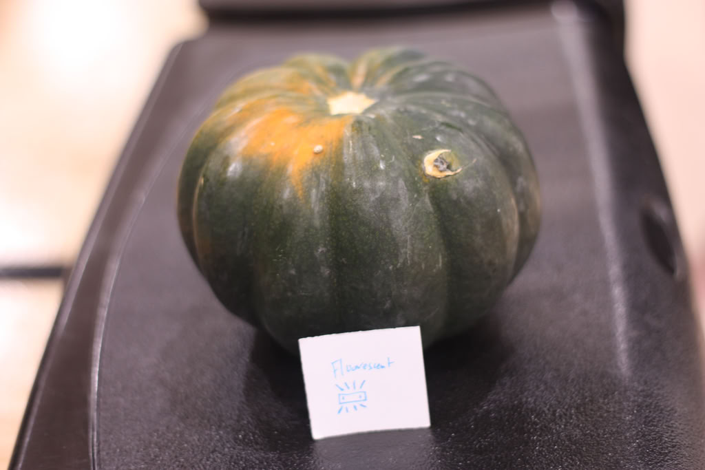
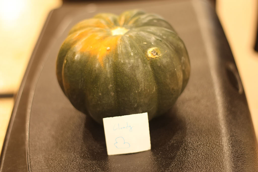
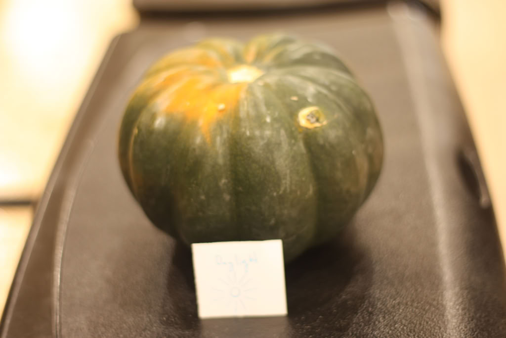
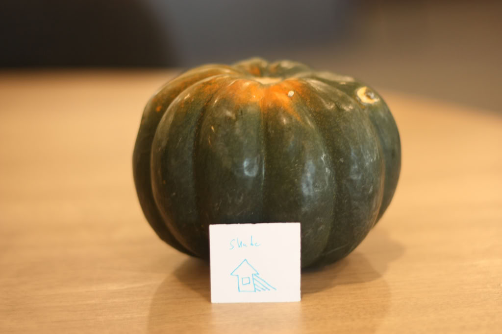
These five pictures were all taken in the library with different white balance settings for each. All of these sets show that depending on the setting, it will be better for the picture if you use the appropriate white balance setting for the mood you want to convey.
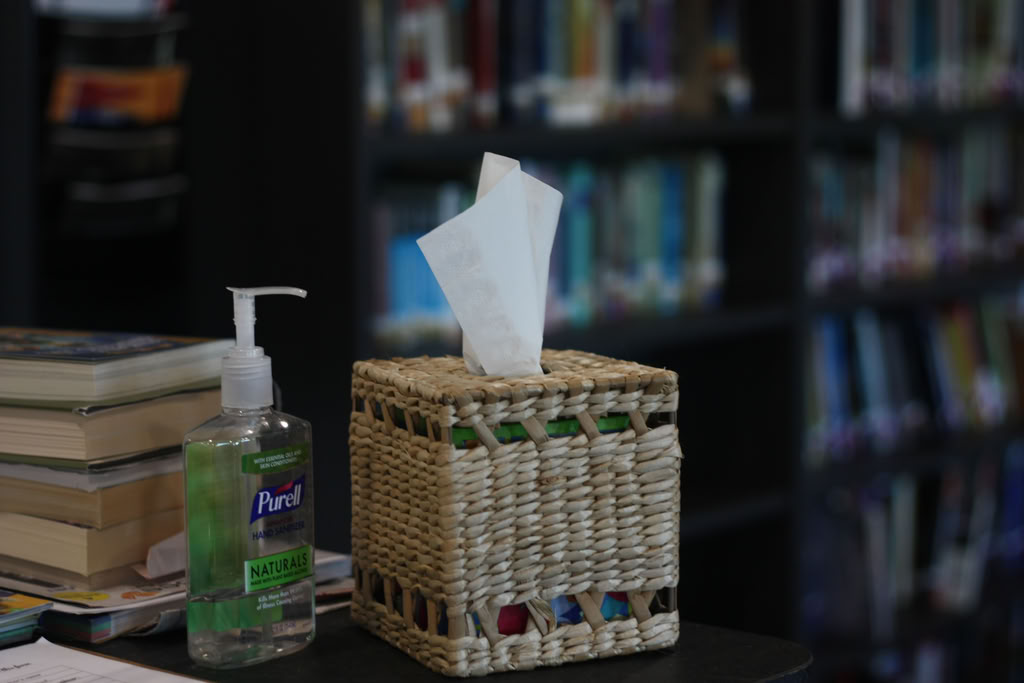
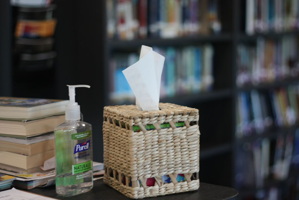
These three pictures are an example of bracketing. The one on the left is over exposed, then it switches to overexposed. The last picture is the one that the camera thought was perfectly exposed. I like the middle exposure the most because the tissues don’t look so stark and because I think it’s more fitting for a library to be a little darker and more calming.
Again, these three are set for -1, 0, and +1. I like the last picture in this set the best because it is stark enough that the silhouettes are shows clearly, but you can still see the fields and sky easily.
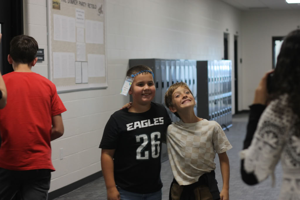
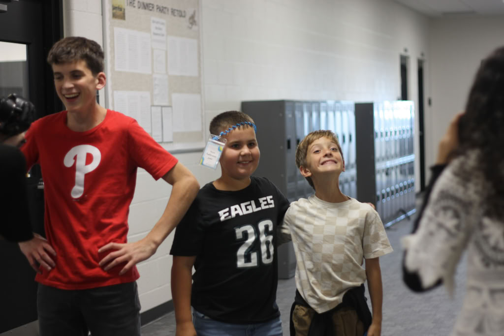
This final set shows the overexposed picture on the left, the underexposed in the middle and then the camera’s favorite on the left. I like the camera’s favorite the best in this set because the faces aren’t too dark and because they aren’t as washed out as the first picture.
I like this picture the best because it shows that even though the camera doesn’t like it as much, it’s still a good picture. If I had not used bracketing, I would’ve had to settle for a more exposed version. The tissues still look crisp, but not as over bearing as the ones in the other two pictures the camera took. I also like that the background is a nice dark spot for the tissues to contrast against.